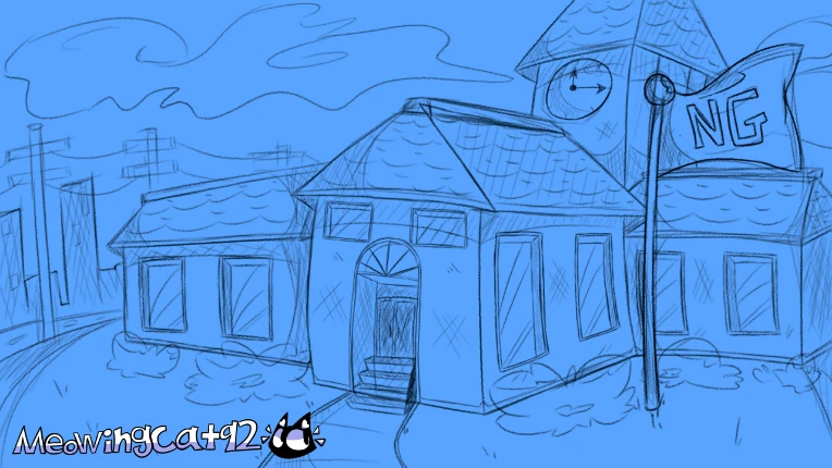
Is there anything I should add or change to this before trying to color? I've resketched it over 5 times and this is the only finished sketch that I like. I am also working on a different background, but I think I will likely redo that one as well and make it much nicer.

This was the older version of the background:
VariableGR
It looks good, I like the curves that the buildings have, it gives it a more cartoon touch
Before coloring, keep in mind where the light is positioned and how it is reflected, use bright colors for the most striking parts such as the flag and part of the ceiling
The city that is behind tries to color it with muted colors to represent the remoteness of the building
I'm not an expert in drawing but good luck (≧ ▽ ≦) (╹ ▽ ╹)